ABOUT THE COMPANY
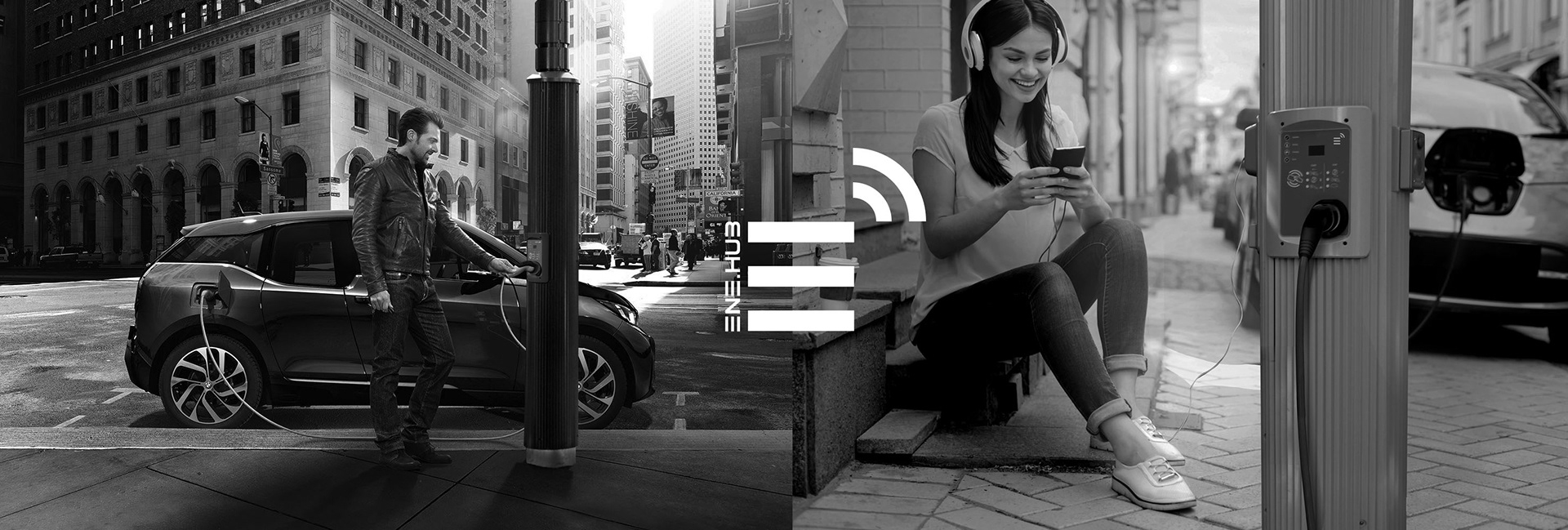
ENE.HUB is a fully integrated Smart City Infrastructure provider with operations in Australia and the USA. ENE.HUB plans, funds, builds, maintains and manages connected networks of SMART.NODE. The SMART.NODE is a light pole system that invisibly accommodates the following functions: Wi-Fi, 4G / 5G; data-capture; smart wireless LED street, roadway, area lighting and floodlights / spotlights; banner arms; decorative beacons (RGB light); CCTV; speakers and community messaging; electric vehicle charging (EVC) and parking management. They also provide events power outlets (GPOs) and traditional smart pole functions such as signage, traffic and lighting.
ENE.HUB is a fully integrated Smart City Infrastructure provider with operations in Australia and the USA. ENE.HUB plans, funds, builds, maintains and manages connected networks of SMART.NODE. The SMART.NODE is a light pole system that invisibly accommodates the following functions: Wi-Fi, 4G / 5G; data-capture; smart wireless LED street, roadway, area lighting and floodlights / spotlights; banner arms; decorative beacons (RGB light); CCTV; speakers and community messaging; electric vehicle charging (EVC) and parking management. They also provide events power outlets (GPOs) and traditional smart pole functions such as signage, traffic and lighting.
IDENTITY
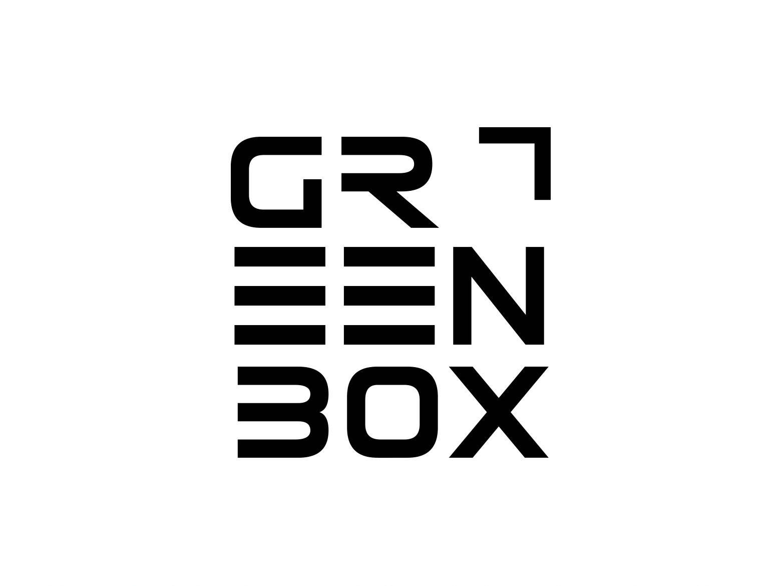
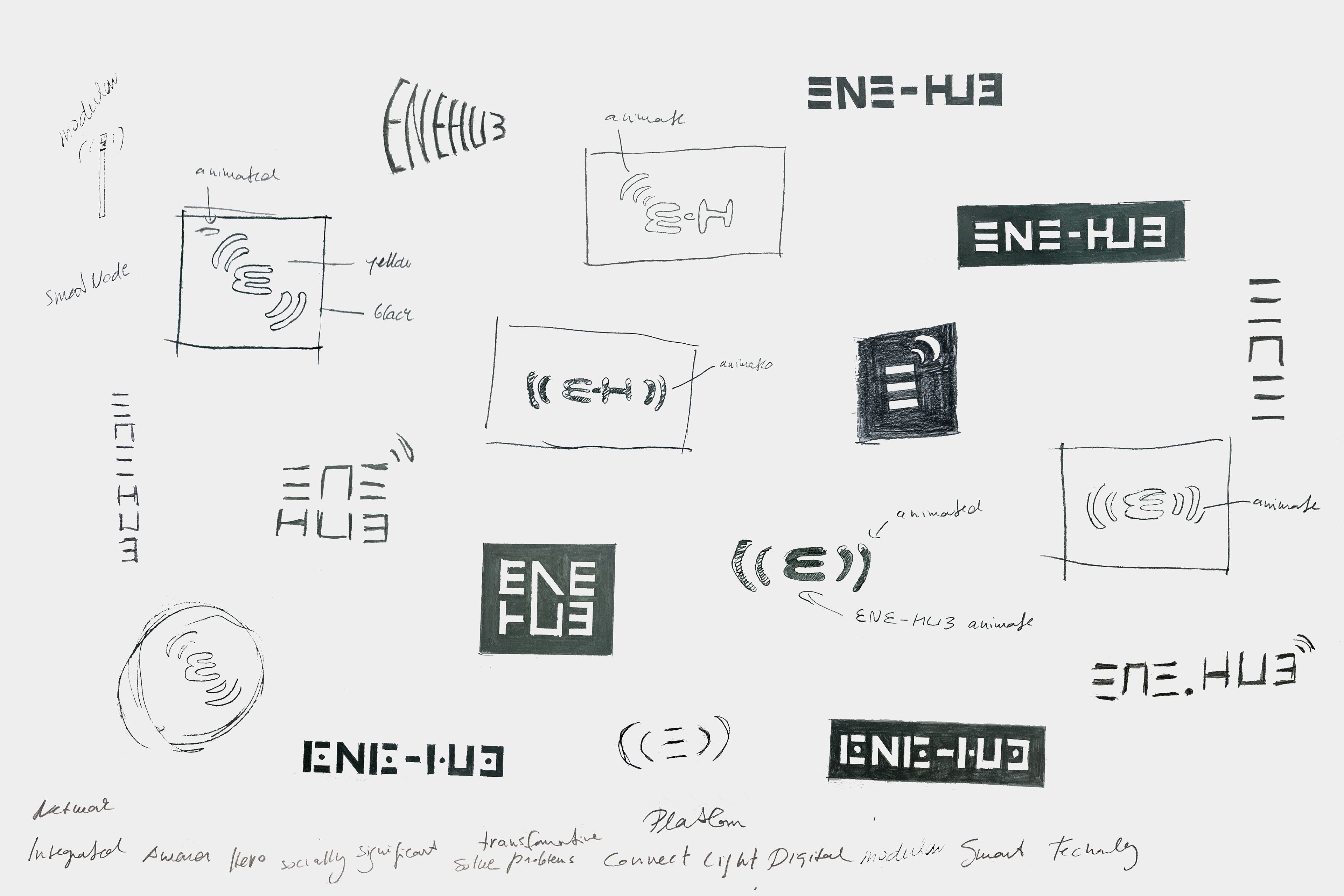
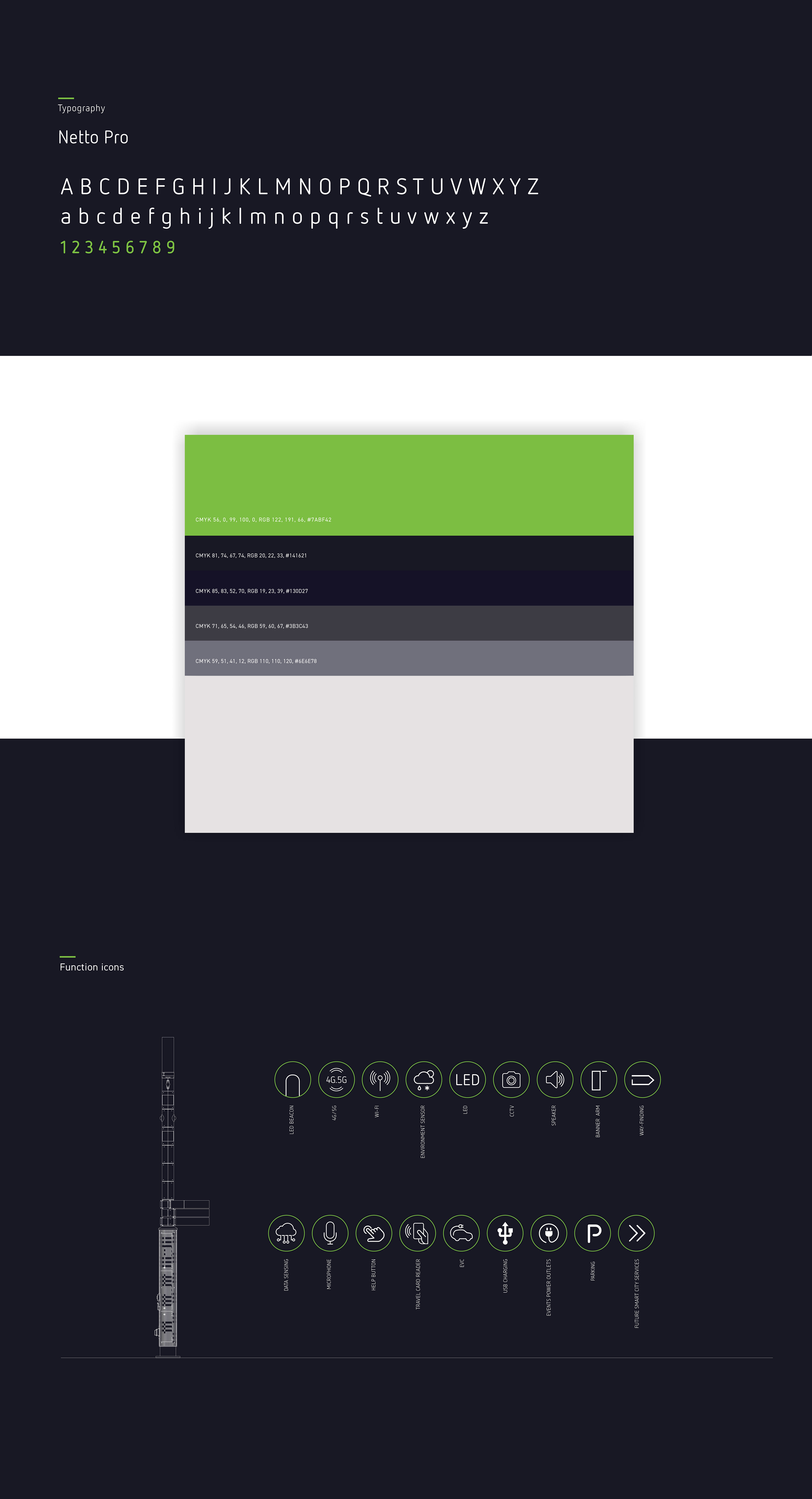
My task was to develop a brand identity for ENE.HUB which visually captured ENE.HUB’s vision, also referring to the innovation and new technology of the business. I made a lot of sketches before the final conclusion, and together with the client selected the symbol as three horizontal lines with Wi-Fi arches as the identity. The three lines make up an E - the initial of ENE.HUB. The three lines also refer to the modular system of SMART.NODETM.
My task was to develop a brand identity for ENE.HUB which visually captured ENE.HUB’s vision, also referring to the innovation and new technology of the business. I made a lot of sketches before the final conclusion, and together with the client selected the symbol as three horizontal lines with Wi-Fi arches as the identity. The three lines make up an E - the initial of ENE.HUB. The three lines also refer to the modular system of SMART.NODETM.

WEBSITE
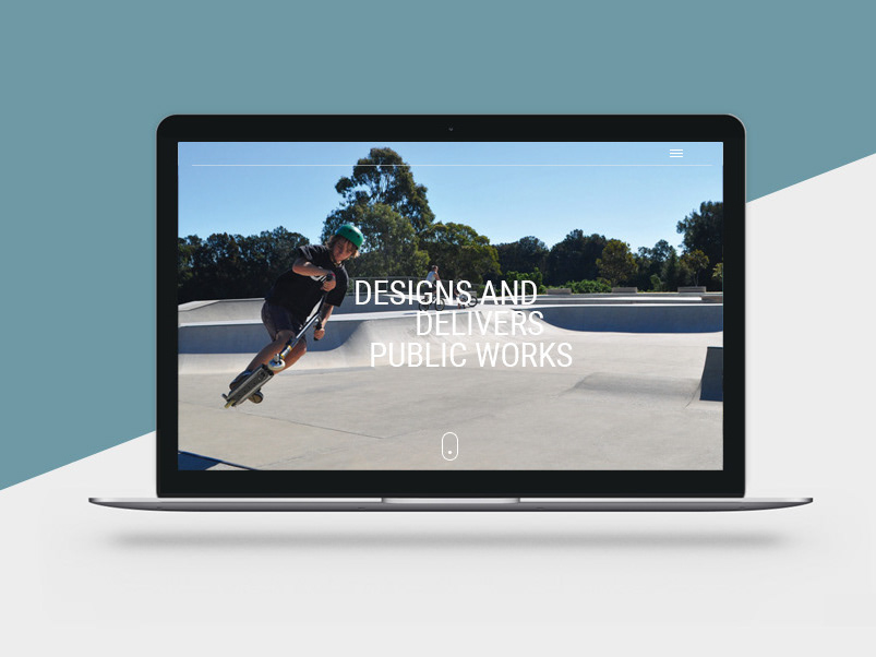
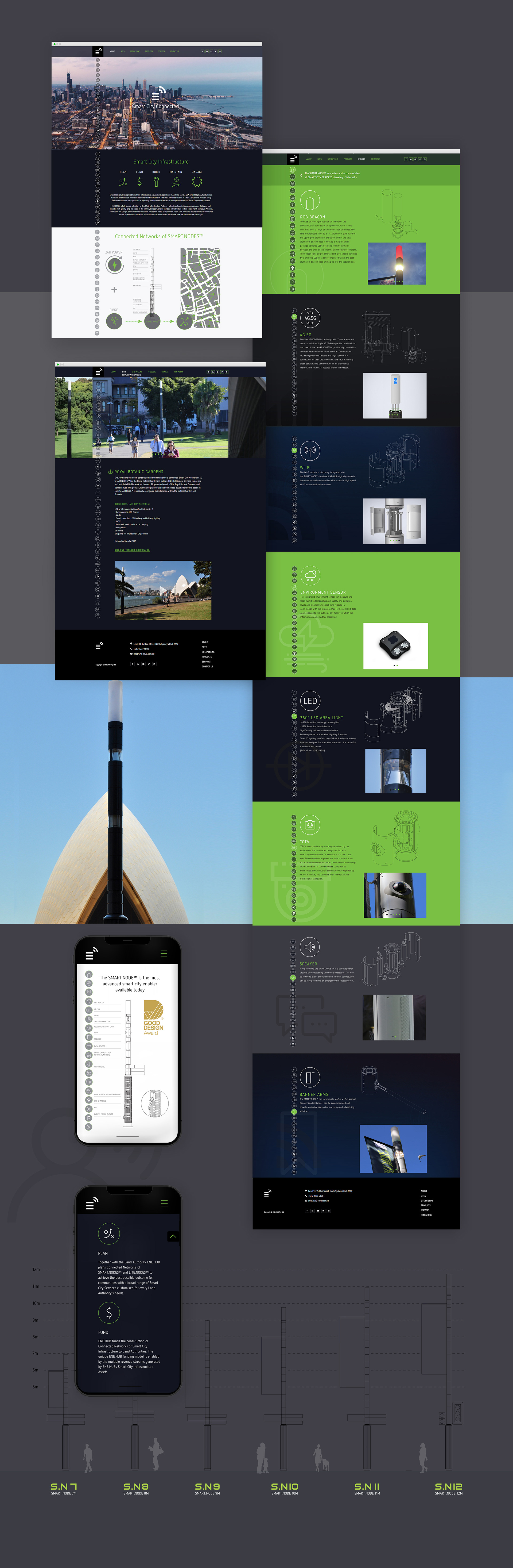
It was a challenging and exciting journey to build a website for ENE.HUB. My aim was to create a simple-to-navigate, story-telling homepage outlining what ENE.HUB offers. For each smart city function I created an icon as a visible and accessible button on the website, giving quick and direct access to the relating sub-page. I utilised these icons in print materials as well. I used photographs I had taken on ENE.HUB’s sites, for example, the Royal Botanic Gardens and Canada Bay in Sydney and I worked with a web developer to implement the responsive design. I provided design for desktops, tablets / Ipads and mobile devices.
It was a challenging and exciting journey to build a website for ENE.HUB. My aim was to create a simple-to-navigate, story-telling homepage outlining what ENE.HUB offers. For each smart city function I created an icon as a visible and accessible button on the website, giving quick and direct access to the relating sub-page. I utilised these icons in print materials as well. I used photographs I had taken on ENE.HUB’s sites, for example, the Royal Botanic Gardens and Canada Bay in Sydney and I worked with a web developer to implement the responsive design. I provided design for desktops, tablets / Ipads and mobile devices.
PRINTS
Business cards and company brochure
Business cards and company brochure